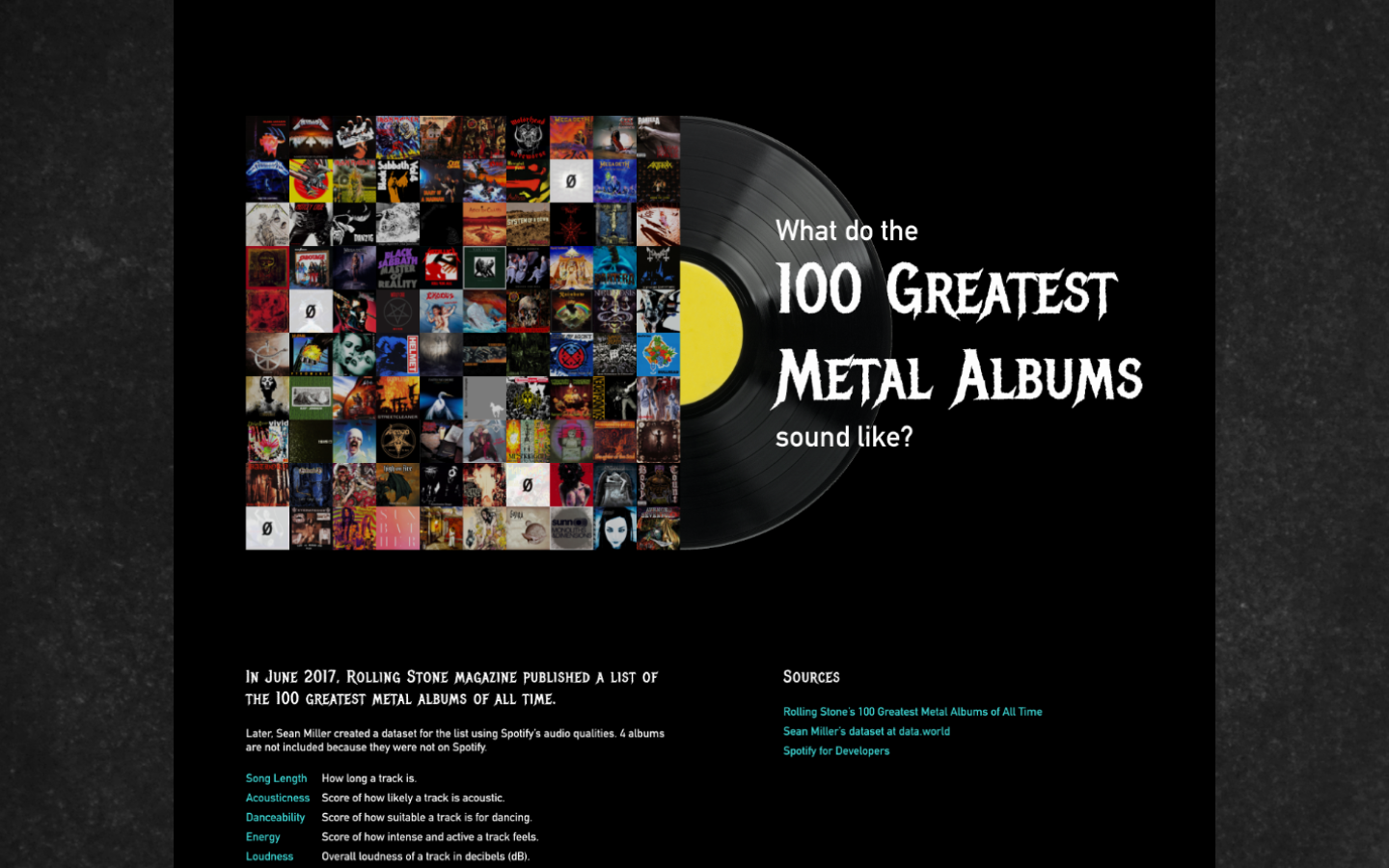
What do the 100 greatest metal albums sound like?
Data analysis and visualizationThis data visualization project is about Rolling Stone’s 100 Greatest Metal Albums and how they “sound” based on Spotify’s API.
I’m a casual fan of metal music, so this dataset was a fun way to apply what I learned from data visualization classes at Parsons. Data cleansing, analysis, and visualization done with Tableau. Visual design in Figma.
View the project here.

Composing the story
The dataset contains two sheets with different levels of granularity.- The first has subjective, qualitative data about each album. Examples: rankings, ratings, subgenres.
- The second is about songs on the albums. It breaks them down into measurable audio attributes from Spotify. Examples: beats per minute, track order, energy level, and danceability scores.
I started with an exploratory data analysis in Tableau for albums and songs to find a few potential story ideas.
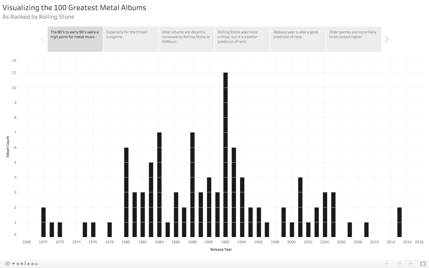

After a few iterations of Tableau charts and paper sketches, I wanted to know what the composition of these 100 albums look like.
- What does the overall structure of an album look like, from the first track to the last?
- What are some examples? Highlight a few albums, like the top ranked and the most popular.
- What are specific factors that correlate to Rolling Stone’s ranking and Spotify popularity? Would they be the same factors or not?


Cleaning the dataset
A few things to clean up before designing: - Combine the two sheets into one so that I can aggregate audio attributes by album and track number.
- Correctly calculate song duration because it was misclassified as date/time.
- Find any outliers and check for errors. A live album was accidentally included in the dataset — it had too many tracks compared to a typical studio album.


Fitting the aesthetic to the genre
I added more details on top of a simple design system:- Typefaces that could be on logos, albums, posters, etc.
- Dark-mode color palette with saturated colors.
- Iconic album art as part of the visualization.
View the project here.